
My journey in AICE Media Studies
Blog entry
|
Task 1 – Enquiry – LANGUAGE ANALYSIS
Task 2 – ARTICLE IDEA DEVELOPMENT :
|
Blog entry 11/2-11/4Reflect.
|
|
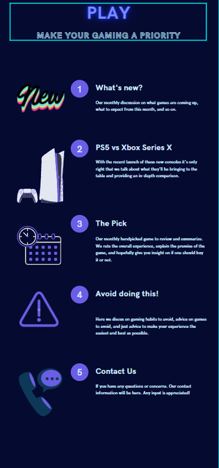
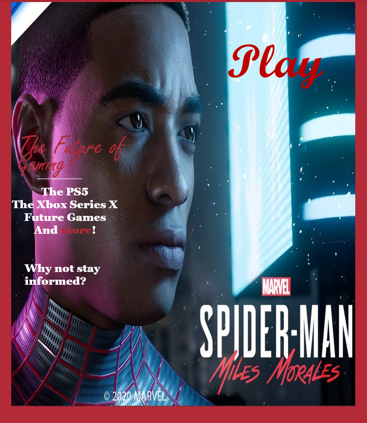
This here is concept design to match my magazine cover mockup. I tried to capture what my magazine would be like with a concise overview of it all while still having a cryberpunkish vibe. It's pretty simplistic and looks like a standard TOC, to help balance it out I had a very blue color scheme and had some images to fill the white space. The colors help lay for a versatile distribution, they're perfect for an online magazine but can likewise be printed neatly on paper. In addition, the images and colors help to cater to my proposed audience, that being gamers with relatable/pleasant images & colors like the PS5 and color blue. Overall, I think I did well for a test concept, but I feel like there's something I could improve upon.
So I asked a friend who happens to be gamer. In summary, he said that the main articles like "The Pick" definitely appeal to my audience as relevant and current articles of information which was my main goal with them. However, my pages for the contact information and health tips didn't really make sense to him, which, in retrospect, makes sense, most magazines don't have contact info as page and a gaming magazine shouldn't be about lifestyle. So those are some elements I should rethink. |
Blog entry
|
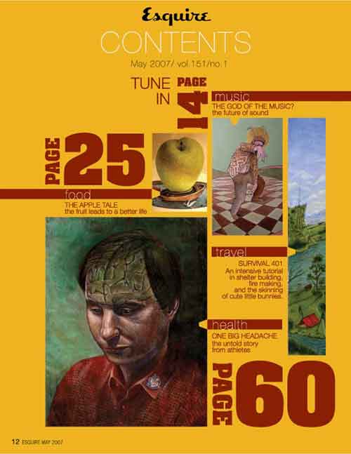
This TOC is a bold example of how font colors, sizes, and prints can make a huge difference. When making a table of contents the use of bold text can help emphasize certain contents a demonstrated here with the page number, but the font colors is what makes the text fluid and coherent. It's nice to see the blend of elements here to make a cohesive TOC. 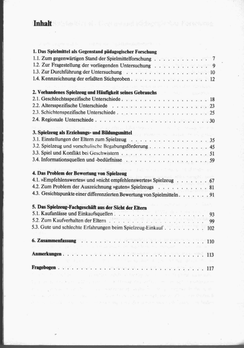
Reflect |
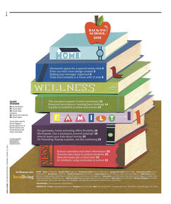
This first example of a Table of Contents (TOC) really just goes to show how creative it can be but still informative. The incorporation of the school-related items gives us a hint as to what we'll be seeing but also gives the TOC depth and makes it much more pleasing to look at.
Although not an overall good TOC for creative design and/or being an appealing design, it still has one crucial feature all TOCs should have. That is organization, a well-organized TOC is what makes or breaks the TOC, how else would one locate certain contents without searching for it in a magazine of possibly dozens of articles?
|
These three examples while despite not being representative of my magazine cover and possible contents...they still provide the basis for what I stride to have when making a TOC. A TOC should be able to give the proper information but should also visually fit the theme of our magazine and display creativity. For a magazine like the one I currently have in mind, things like current game politics, new games (e.g. the new Spiderman or Cyberpunk 2077), and information about gaming in general are definite must haves in my TOC and magazine.
Blog entries 10/18-10/23 Main points:
|
A first step Now this is my first mock/practice version of my future magazine cover. There are clearly many issues to mend as mentioned by my teacher. For example, the font colors, the details in the write-up, and so on could all be improved. Fortunately, this is certainly a step in the right direction.
|
|
Practice Candidate Response
Obviously, compared to the real deal, I have a lot of work to do. My response is very short, concise, it lacks detail in contrast to the example response's extensive and in-depth look at all the key concepts discussed, i.e., the mise-en-scène, the camerawork, sound, and editing. However and fortunately, the underlying understanding is still there between both of our response's, which is acknowledging how the the aforementioned concepts create a mundane, realistic, rapid plot setup. The clip was a great example of how the tiniest of details like the character's mannerisms and abrasive sounds of the laundry machine really make the difference within the build-up.
As for the difference between the example's notes and mine, it's minimal at best in terms of setup, they're both really just observations, which is debatable in terms of usefulness and quality. The only real difference between my notes and the example's was mainly the depth in terms of vocabulary and number of observations, the example had their observations done with much more detail and definitely displayed a greater understanding of the terms. In essence, this being my first ever response, I have a decent start, but there is a lot I could improve upon, especially in things like detail, elaboration, and articulation.
As for the difference between the example's notes and mine, it's minimal at best in terms of setup, they're both really just observations, which is debatable in terms of usefulness and quality. The only real difference between my notes and the example's was mainly the depth in terms of vocabulary and number of observations, the example had their observations done with much more detail and definitely displayed a greater understanding of the terms. In essence, this being my first ever response, I have a decent start, but there is a lot I could improve upon, especially in things like detail, elaboration, and articulation.
Blog entry 9/24-9/28 |
Intertexuality is essentially the relationship among text or video that shapes their meaning via recognizable allusions or references. All to create a new experience or dynamic between the two articles of video/text by adding depths of meaning through their relationship. There are a few types of intertextuality...them being direct, indirect, and inferred. Direct being a specific reference to another text, indirect being through the overall style or genre of the referred text, and inferred being a connection between texts through the viewer that hadn't previously existed before.
|
|
Main points:
|
|

Blog entry 9/18-9/22 What can you tell about the type of magazine it is; what kinds of articles it contains; who is likely to read it? Why?
|
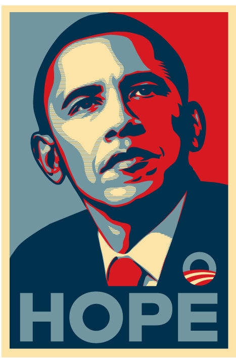
This cover says a lot with simply some organization, a photo, and some text. The overall layout of the cover is for lack of better words, pleasant to look at. The colors all have a nice blend, it simply matches in the right places (e.g., the masthead and the border). In conjunction, the cover is sending a powerful message. Through the photo of an icon, bold text, and an allusion to a revolutionary movie, the cover is definitely empowering and inspiring. Not only for the people of the time when this was published, but even more so now. With the recent events that unfolded this year, the message of black power and inspiration has never ringed more true.
Disregarding all of that, the cover is also alluding to their subject matter and main topics. Made evident by their signature colors and title, it's more than obvious that this is Time Magazine. As such, based on that we can already infer what the magazine will cover, as Time Magazine is renowned for their take on current events and media. In addition, the allusion to a popular film and the photo of the actress in the cover also hints at the overall coverage of Time Magazine. Overall, the cover of this issue from Time Magazine is masterfully crafted and their main subject line is certainly illustrated. |
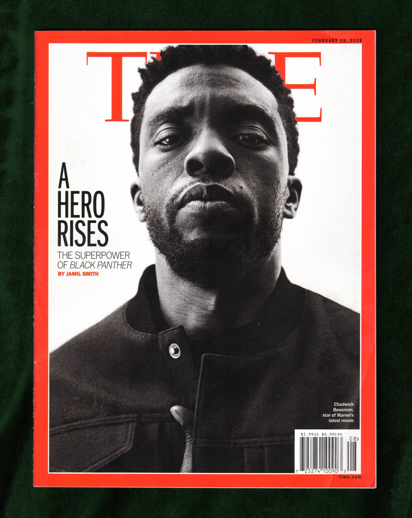
Source: https://time.com/magazine/us/5139093/february-19th-2018-vol-191-no-6-u-s/
|
